
Import any data from JSON API
Welcome to our data exploration journey! 🚀 In this exciting venture, we’re harnessing the power of data from the renowned source https://data.askbhunte.com/api/v1/covid. Our toolkit is all set, and we’re armed with two remarkable packages:
-
jsonlite: This versatile gem brings JSON data and R data types together in a harmonious symphony. With its bidirectional mapping prowess, we’ll seamlessly navigate between JSON and R’s essential data forms. -
RCurl: Picture this as your virtual gateway to the online universe. With this tool in hand, we’ll effortlessly access URIs, data, and services using the mighty force of HTTP.
So buckle up as we dive into the world of data transformation and exploration, armed with these incredible packages. Together, we’ll unravel insights, uncover trends, and make data sing! 📊🌐
install.packages('RCurl')
Installing package into ‘/usr/local/lib/R/site-library’
(as ‘lib’ is unspecified)

also installing the dependency ‘bitops’
library(jsonlite)
library(RCurl)
url <- getURL("https://data.askbhunte.com/api/v1/covid",
.opts=list(followlocation=TRUE, ssl.verifyhost=FALSE, ssl.verifypeer=FALSE))
Now, save the imported data as “covidtbl” data frame in R
covidtbl <- fromJSON(txt=url, flatten=TRUE)
#covidtbl
Check whether the saved “covidtbl” data passes the three conditions of the “tidy” data or not! If not, make it a tidy data with explanations of rows, columns and cells in the data
Let’s explore how our dataset, covidtbl, effortlessly satisfies the three golden rules of tidy data, ensuring its pristine tidiness:
-
Each Variable Must Have Its Own Column: Within our
covidtbldataset, each distinct variable is bestowed with its very own dedicated column. Whether it’s ‘Date’, ‘Country’, ‘Confirmed Cases’, or ‘Recovered Cases’, the variables stand tall, well-defined in their respective columns. -
Each Observation Must Have Its Own Row: The elegance of our
covidtblis such that every individual observation resides neatly in its designated row. Each row signifies a distinct combination of attributes, providing a comprehensive view of our data landscape. -
Each Value Must Have Its Own Cell: Behold the glory of cells! Each cell within our
covidtblcradles a single, precious value. From the confirmed cases count to the recovery figures, every value occupies its personal cell, contributing to the clarity and structure of our data.
As we scrutinize the meticulous alignment of columns, rows, and cells within our dataset, it becomes undeniable: our covidtbl data epitomizes the epitome of tidiness. With a triumphant nod to the three conditions of tidy data, we can confidently declare our dataset to be nothing short of perfectly tidy! 🧹📊📋
covidtbl
Check if there are duplicate cases in the data using “id” variable, remove duplicate cases, if found, using R base functions: duplicated or unique
Behold the twin guardians of data integrity: the mighty duplicated() and the elegant unique() functions. 🛡️🌟
duplicated(): With its watchful eye, this function stands as a sentinel, tirelessly scanning for the presence of duplicate values within our dataset. When duplicity is detected, it raises the banner of TRUE, a resounding alert that caution is needed. Yet, when tranquility reigns, and duplicates are but a mirage, it returns the serene embrace of FALSE.
unique(): This function, a maestro of singularity, waltzes through our data, gracefully curating a collection of unique values. With a deft touch, it parts ways with duplicates, leaving behind only the gems of distinctiveness. Each value, a luminary in its own right, shines without the burden of repetition.
As we navigate our data landscape, these functions are our loyal guides, preserving the sanctity of uniqueness and vigilantly guarding against the stealthy intrusion of duplicates. With them by our side, we tread a path of integrity and clarity, ensuring our data remains an oasis of precision. 🌐🔍📊
duplicated(covidtbl)
unique(covidtbl)
Clean the “gender” variable and show the number and percentage of males and females in the data
Navigating the realm of data cleaning requires our vigilant attention to a constellation of critical points. Let’s embark on this journey with a compass tuned to precision:
-
Freedom from Duplicates: Duplicate rows/values are the shadows that obscure accuracy. Our mission: eliminate them from the data tapestry.
-
Error-Free Voyage: The tapestry must be free of misspellings, ensuring each thread weaves the correct narrative.
-
Relevance Reigns: Special characters, those unruly guests, have no place here. Our data deserves clarity sans their distractions.
-
Data Type Deliberation: Assigning the appropriate data type is our pledge. With it, analysis thrives.
-
Taming Outliers: Outliers, if understood, may reside. Others, banished. Our narrative dictates precision.
-
Tidiness Triumphs: The “tidy data” creed rules our path. Rows and columns align, each cell holding one truth.
Amidst this voyage, a herald arrives: stringer takes the stage. This enchanting spell transforms words, capitalizing the first and humbling the rest. An elixir to unify our data’s voice, bridging the gap between lowercase and uppercase tales.
Together, we stride forward, guided by the stars of data cleaning, ensuring the brilliance of our data’s truth shines unimpeded. 🧹🌟📊
install.packages("stringr")
Installing package into ‘/usr/local/lib/R/site-library’
(as ‘lib’ is unspecified)
Following code loads the stringr library and remove the missing value present in our gender column.
df<- covidtbl[complete.cases(covidtbl$gender),]
In the realm of transformations, let’s wield the power of the stringr library as our wand. With it, we shall metamorphose the gender data, aligning them to a harmonious tune.
Behold the enchantment:
library(stringr)
df <-toupper(df$gender)
df <- str_to_title(df)
Now, it is time to calculate total number of male and female from gender column.
df1<- table(df)
df1
df
Female   Male
 21403  56355
To find the percentage of male and female we can do,
prop.table(df1)
df
   Female      Male
0.2752514 0.7247486
Clean the “age” variable and show the summary statistics of the age variable
In the realm of data, the journey toward immaculateness commences with a process of purification. Let us unveil the steps to cleanse the age column by removing its elusive missing values
df_age <- covidtbl[complete.cases(covidtbl$age),]
age <- df_age$age

age
<ol class=list-inline><li>28</li><li>34</li><li>26</li><li>29</li><li>20</li><li>72</li><li>60</li><li>24</li><li>58</li><li>52</li><li>41</li><li>41</li><li>34</li><li>41</li><li>28</li><li>28</li><li>28</li><li>22</li><li>25</li><li>40</li><li>33</li><li>18</li><li>65</li><li>32</li><li>20</li><li>37</li><li>55</li><li>36</li><li>55</li><li>19</li><li>65</li><li>21</li><li>34</li><li>65</li><li>81</li><li>19</li><li>27</li><li>32</li><li>57</li><li>26</li><li>44</li><li>35</li><li>9</li><li>32</li><li>34</li><li>50</li><li>25</li><li>62</li><li>21</li><li>34</li><li>40</li><li>55</li><li>60</li><li>30</li><li>55</li><li>29</li><li>65</li><li>80</li><li>17</li><li>60</li><li>26</li><li>27</li><li>58</li><li>60</li><li>52</li><li>30</li><li>65</li><li>37</li><li>4</li><li>35</li><li>11</li><li>40</li><li>22</li><li>24</li><li>65</li><li>32</li><li>18</li><li>18</li><li>38</li><li>45</li><li>63</li><li>30</li><li>25</li><li>27</li><li>28</li><li>28</li><li>45</li><li>32</li><li>60</li><li>16</li><li>61</li><li>22</li><li>24</li><li>25</li><li>28</li><li>28</li><li>32</li><li>59</li><li>55</li><li>61</li><li>22</li><li>28</li><li>32</li><li>32</li><li>4</li><li>10</li><li>28</li><li>20</li><li>35</li><li>22</li><li>40</li><li>18</li><li>36</li><li>32</li><li>27</li><li>25</li><li>25</li><li>22</li><li>49</li><li>36</li><li>29</li><li>20</li><li>28</li><li>23</li><li>30</li><li>36</li><li>75</li><li>36</li><li>9</li><li>23</li><li>47</li><li>10</li><li>28</li><li>29</li><li>65</li><li>17</li><li>18</li><li>18</li><li>30</li><li>36</li><li>37</li><li>26</li><li>25</li><li>25</li><li>32</li><li>25</li><li>48</li><li>39</li><li>48</li><li>28</li><li>30</li><li>33</li><li>21</li><li>25</li><li>25</li><li>29</li><li>42</li><li>21</li><li>30</li><li>22</li><li>18</li><li>19</li><li>19</li><li>22</li><li>23</li><li>20</li><li>28</li><li>30</li><li>40</li><li>27</li><li>42</li><li>41</li><li>51</li><li>27</li><li>37</li><li>26</li><li>26</li><li>28</li><li>30</li><li>46</li><li>17</li><li>18</li><li>53</li><li>55</li><li>22</li><li>22</li><li>45</li><li>74</li><li>19</li><li>35</li><li>34</li><li>35</li><li>24</li><li>30</li><li>27</li><li>34</li><li>19</li><li>38</li><li>45</li><li>27</li><li>⋯</li><li>62</li><li>73</li><li>53</li><li>67</li><li>54</li><li>56</li><li>33</li><li>58</li><li>62</li><li>74</li><li>47</li><li>30</li><li>67</li><li>29</li><li>65</li><li>51</li><li>30</li><li>64</li><li>66</li><li>66</li><li>76</li><li>74</li><li>22</li><li>88</li><li>48</li><li>66</li><li>41</li><li>82</li><li>31</li><li>75</li><li>77</li><li>65</li><li>70</li><li>70</li><li>62</li><li>50</li><li>32</li><li>23</li><li>37</li><li>90</li><li>83</li><li>76</li><li>69</li><li>39</li><li>63</li><li>59</li><li>87</li><li>62</li><li>35</li><li>34</li><li>86</li><li>54</li><li>82</li><li>76</li><li>67</li><li>39</li><li>56</li><li>65</li><li>83</li><li>52</li><li>55</li><li>45</li><li>51</li><li>52</li><li>71</li><li>72</li><li>72</li><li>92</li><li>77</li><li>40</li><li>77</li><li>65</li><li>40</li><li>70</li><li>50</li><li>20</li><li>74</li><li>88</li><li>65</li><li>72</li><li>86</li><li>65</li><li>74</li><li>55</li><li>89</li><li>70</li><li>75</li><li>55</li><li>18</li><li>65</li><li>20</li><li>70</li><li>47</li><li>40</li><li>97</li><li>60</li><li>60</li><li>72</li><li>80</li><li>67</li><li>40</li><li>75</li><li>35</li><li>70</li><li>64</li><li>45</li><li>77</li><li>73</li><li>80</li><li>67</li><li>83</li><li>38</li><li>61</li><li>76</li><li>43</li><li>78</li><li>85</li><li>51</li><li>45</li><li>70</li><li>59</li><li>83</li><li>55</li><li>62</li><li>85</li><li>70</li><li>61</li><li>73</li><li>47</li><li>40</li><li>73</li><li>55</li><li>63</li><li>72</li><li>60</li><li>55</li><li>36</li><li>61</li><li>55</li><li>55</li><li>58</li><li>35</li><li>64</li><li>86</li><li>34</li><li>96</li><li>66</li><li>69</li><li>20</li><li>61</li><li>62</li><li>50</li><li>51</li><li>50</li><li>34</li><li>38</li><li>47</li><li>86</li><li>60</li><li>66</li><li>85</li><li>50</li><li>59</li><li>72</li><li>49</li><li>58</li><li>61</li><li>17</li><li>68</li><li>88</li><li>58</li><li>73</li><li>84</li><li>62</li><li>55</li><li>52</li><li>63</li><li>50</li><li>34</li><li>75</li><li>78</li><li>55</li><li>50</li><li>39</li><li>68</li><li>70</li><li>32</li><li>84</li><li>39</li><li>73</li><li>75</li><li>51</li><li>58</li><li>72</li><li>60</li><li>70</li><li>57</li><li>53</li><li>39</li><li>76</li></ol>
Now, we removed the NA values. To explore summary statistics of the age,
summary(age)
   Min. 1st Qu.  Median    Mean 3rd Qu.    Max.
   1.00   23.00   35.00   38.93   53.00  523.00
Gazing upon the tapestry of summary statistics for the age column within the covidbl table, a spectrum of insights emerges:
-
The minimum age among the populace stands at a youthful 1, symbolizing the presence of even the tiniest among us.
-
Positioned at the first quartile, the age of 23 unveils a quarter of our populace’s journey into adulthood.
-
At the heart of our age distribution lies the median, a stately figure of 35, embodying the balance of ages within our domain.
-
The average age, a symphony of all ages combined, resonates at 38.93, offering a glimpse into the collective experience.
-
Ascending to the third quartile, the age group of 53 showcases the seasoned among us, reflecting a stage of maturity.
-
Behold the zenith, the pinnacle of ages within our realm: 523. An outlier among us, a testament to outliers’ potential influence.
Through these statistics, we glimpse the diverse tapestry of ages woven into the covidbl table. Each number, a thread in this data fabric, paints a portrait of our populace’s chronological voyage.
Transform cleaned age variable into broad age groups i.e. <15, 15-59, 60+ years, define it as factor variable and get number and percentage of this variable
less_then_15 <- df_age$age < 15
below_15<- df_age[less_then_15,]$age
below_15<- factor(below_15)
table(below_15)
below_15
 1  2  3  4  5  6  7  8  9 10 11 12 13 14
 4  8  2 12  5  5  4  7  6  5  5  5  3  6
prop.table(table(below_15))*100
below_15
        1         2         3         4         5         6         7         8
 5.194805 10.389610  2.597403 15.584416  6.493506  6.493506  5.194805  9.090909
        9        10        11        12        13        14
 7.792208  6.493506  6.493506  6.493506  3.896104  7.792208
between_15_59 <- (df_age$age <= 59)
between_15_59<- df_age[between_15_59,]$age
between_15_59 <- between_15_59[between_15_59>=15]
between_15_59<- factor(between_15_59)
table(between_15_59)
between_15_59
15 16 17 18 19 20 21 22 23 24 25 26 27 28 29 30 31 32 33 34 35 36 37 38 39 40
11 19 27 50 35 47 24 45 34 24 47 26 36 32 21 43 16 36 14 31 41 34 17 24 16 48
41 42 43 44 45 46 47 48 49 50 51 52 53 54 55 56 57 58 59
18 14  6  3 34 11  8 14  9 28 13 14  9 10 27  8  7 16 11
prop.table(table(between_15_59))*100
between_15_59
       15        16        17        18        19        20        21        22
1.0396975 1.7958412 2.5519849 4.7258979 3.3081285 4.4423440 2.2684310 4.2533081
       23        24        25        26        27        28        29        30
3.2136106 2.2684310 4.4423440 2.4574669 3.4026465 3.0245747 1.9848771 4.0642722
       31        32        33        34        35        36        37        38
1.5122873 3.4026465 1.3232514 2.9300567 3.8752363 3.2136106 1.6068053 2.2684310
       39        40        41        42        43        44        45        46
1.5122873 4.5368620 1.7013233 1.3232514 0.5671078 0.2835539 3.2136106 1.0396975
       47        48        49        50        51        52        53        54
0.7561437 1.3232514 0.8506616 2.6465028 1.2287335 1.3232514 0.8506616 0.9451796
       55        56        57        58        59
2.5519849 0.7561437 0.6616257 1.5122873 1.0396975
greater_than_60 <- df_age$age >= 60
above_60 <- df_age[greater_than_60,]$age
above_60 <- factor(above_60)
print(above_60)
  [1] 72  60  65  65  65  81  62  60  65  80  60  60  65  65  63  60  61  61
 [19] 75  65  74  69  70  62  60  60  60  76  76  60  70  60  74  85  65  85
 [37] 83  72  61  62  82  77  61  68  74  68  85  69  75  62  60  64  60  72
 [55] 75  73  67  78  65  64  62  60  84  62  70  72  78  68  523 60  63  70
 [73] 77  80  84  75  60  70  60  60  60  70  60  60  68  65  70  65  65  82
 [91] 75  63  78  70  62  70  76  64  72  65  68  65  68  60  70  64  80  85
[109] 71  75  78  67  72  61  60  62  60  63  82  79  80  82  85  73  68  76
[127] 71  74  87  60  76  60  81  77  65  65  70  64  69  65  76  68  60  70
[145] 70  71  74  65  70  68  77  62  73  67  62  74  67  65  64  66  66  76
[163] 74  88  66  82  75  77  65  70  70  62  90  83  76  69  63  87  62  86
[181] 82  76  67  65  83  71  72  72  92  77  77  65  70  74  88  65  72  86
[199] 65  74  89  70  75  65  70  97  60  60  72  80  67  75  70  64  77  73
[217] 80  67  83  61  76  78  85  70  83  62  85  70  61  73  73  63  72  60
[235] 61  64  86  96  66  69  61  62  86  60  66  85  72  61  68  88  73  84
[253] 62  63  75  78  68  70  84  73  75  72  60  70  76
35 Levels: 60 61 62 63 64 65 66 67 68 69 70 71 72 73 74 75 76 77 78 79 ... 523
Number of days between recovered and reported dates, clean it if required, and get the summary statistics of this variable
Embarking on a journey through the columns of “reportedOn” and “reportedOn,” we’re met with the enigma of missing values. Our initial stride involves parting ways with these elusive entries, fostering a landscape of clarity.
As we gaze upon the columns, we find them draped in the attire of strings. To bring them into the embrace of dates, we wield the wand of transformation, converting them into a date format that speaks the language of time.
Having donned the cloak of dates, we stand at the precipice of an intriguing discovery: the difference between the two dates. With a calculated touch, we measure the interval, uncovering a temporal insight that reveals the span between these two moments.
In this journey of data, the metamorphosis from missing values to dates and the unveiling of differences illuminate the narrative, each step a revelation in the tapestry of analysis.
colnames(covidtbl)
<ol class=list-inline><li>‘id’</li><li>‘province’</li><li>‘district’</li><li>‘municipality’</li><li>‘createdOn’</li><li>‘modifiedOn’</li><li>‘label’</li><li>‘gender’</li><li>‘age’</li><li>‘occupation’</li><li>‘reportedOn’</li><li>‘recoveredOn’</li><li>‘deathOn’</li><li>‘currentState’</li><li>‘isReinfected’</li><li>‘source’</li><li>‘comment’</li><li>‘type’</li><li>‘nationality’</li><li>‘ward’</li><li>‘relatedTo’</li><li>‘point.type’</li><li>‘point.coordinates’</li></ol>
covidtbl_2 <-covidtbl[complete.cases(covidtbl$recoveredOn),]
date_of_recoveredOn <-as.Date(covidtbl_2$recoveredOn)
covidtbl_1 <-covidtbl[complete.cases(covidtbl$reportedOn),]
date_of_reportedOn<- as.Date(covidtbl_2$reportedOn)

diff1<- date_of_recoveredOn - date_of_reportedOn
#print(diff1)
fivenum(diff1)
Time differences in days
[1]   0   1  15  27 179
From the panoramic vista painted by the fivenum summary, a tale of temporal dynamics unfolds. The chronicles of recovered and reported dates interweave, revealing their temporal secrets.
In this narrative, we decipher that the average span between these dates stands at 15 days—a measure that encapsulates the collective rhythm of recoveries.
The median, a sentinel at the center of our temporal symphony, boasts 27 days. This figure, a quintessential representation, resonates with the heart of the dataset.
Yet, among the melodies of time, one crescendo emerges—the crescendo of 179 days. This maximum interval paints a portrait of the furthest stretch between these moments, an outlier among the temporal harmonies.
As we tread this temporal path, it’s apparent that the distribution leans, a testament to its skewness. The data, like a river’s course, follows a path illuminated by insights that enrich our understanding of the temporal tapestry.
Number of days between deaths and reported dates, and summary statistics of this variable
covidtbl_3 <-covidtbl[complete.cases(covidtbl$deathOn),]
death_date <- covidtbl_3$deathOn

death_date<- as.Date(death_date)
diff2 <- death_date - date_of_reportedOn
#list(diff2)
Warning message in unclass(time1) - unclass(time2):
“longer object length is not a multiple of shorter object length”
fivenum(diff2)
Time differences in days
[1] -135   -8   16   53  156
Upon scrutinizing the data above, a revelation unfurls before us. The average duration between deaths and reported dates stands at 16 days—an average that encapsulates the temporal ebb and flow.
In parallel, the median days’ difference mirrors the rhythm of 53 days, positioning itself at the very heart of the distribution. This median, a steadfast guide, symbolizes the midpoint of our dataset’s temporal journey.
However, amid the tapestry of time, a notable crescendo emerges—a crescendo that reverberates with 156 days. This remarkable span signifies the maximum interval, portraying the furthest extent within our temporal landscape.
As we traverse these temporal realms, it becomes evident that insights are etched within each datum, painting a vivid portrait of the dynamic relationship between deaths and reported dates.
Which measures of central tendency and dispersion is most appropriate for the age, diff1 and diff2 variables?
When considering the central tendency for age, the median emerges as the most suitable choice. Several factors substantiate this decision:
Extreme Scores: The distribution harbors a handful of extreme scores. The impact of a lone outlier can disproportionately affect the mean, making the median a more robust choice.
Influential Outliers: A single outlier can wield significant influence over the mean, potentially distorting the representation of central tendency.
Missing or Undetermined Values: The presence of missing or undetermined values further supports the choice of median, as it’s less sensitive to these gaps in data.
Open-Ended Distribution: In scenarios with open-ended distributions, the median offers a more representative measure, unaffected by potential skewing at the tails.
The corresponding measure of dispersion, the Interquartile Range (IQR), harmonizes with the median’s robustness, providing a comprehensive understanding of data spread.
For the variable “diff1,” where negative values and extreme disparities are observed, the median once again shines as the beacon of central tendency. This choice accommodates the data’s peculiarities and maintains stability amidst the diversity of values. The IQR steps forward as the measure of dispersion, aligning harmoniously with the median.
Turning our gaze to the “diff2” data, where pronounced skewness prevails, the median’s selection for central tendency is paramount.
hist(df_age$age, xlim=c(1,100), ylim=c(0,300), breaks = 100)
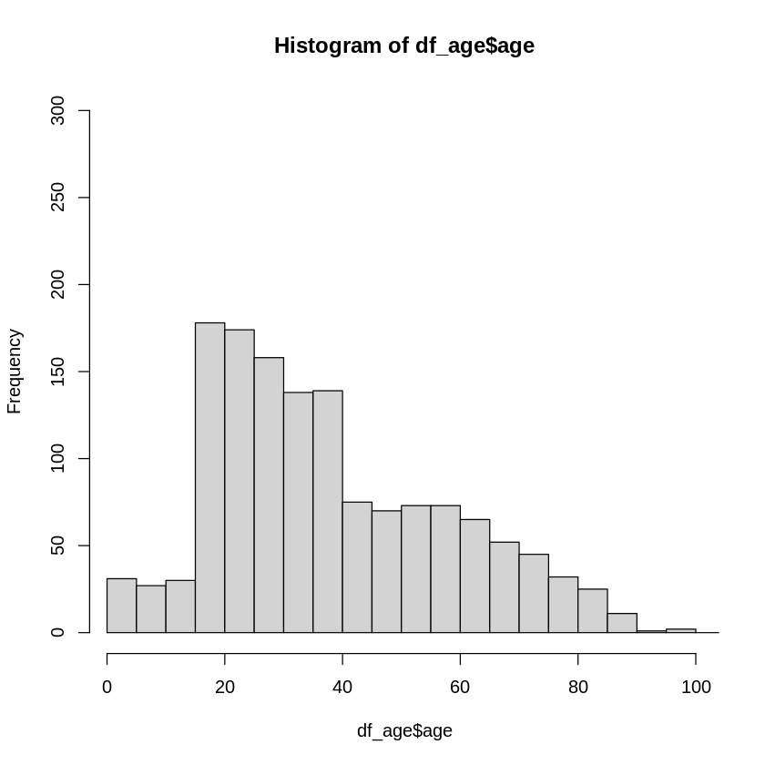
From histogram above we can notice that age groups with heigest frequency belong to the interval 20 - 40.
summary(age)
   Min. 1st Qu.  Median    Mean 3rd Qu.    Max.
   1.00   23.00   35.00   38.93   53.00  523.00
boxplot(age)
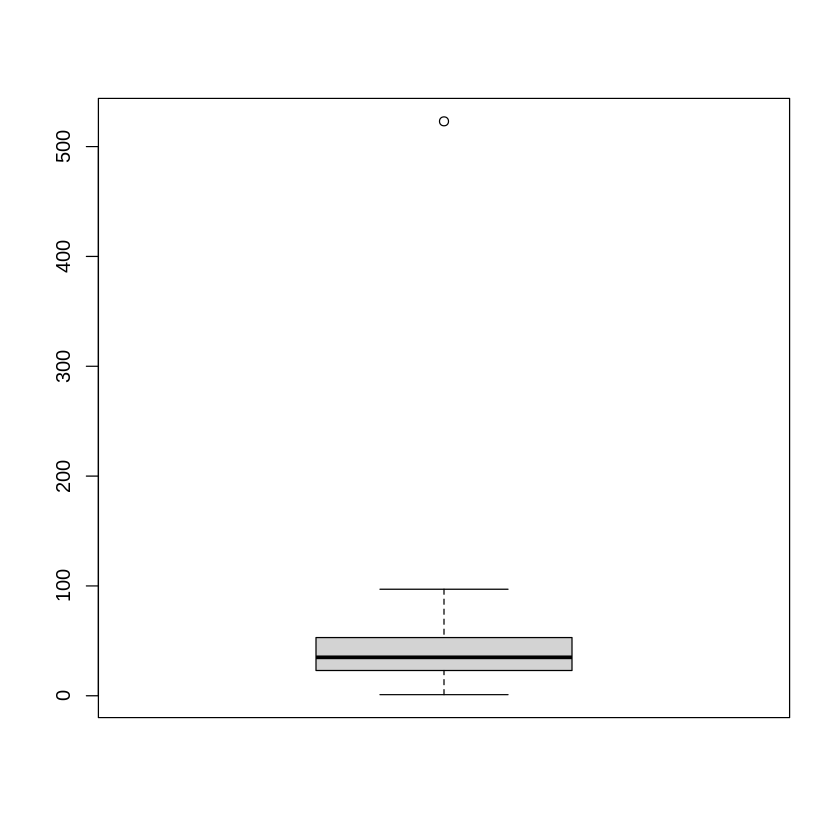
From boxt plot we can see minimum value of age are 1 average value is appromately 39. We can see that there is presence of outliers.
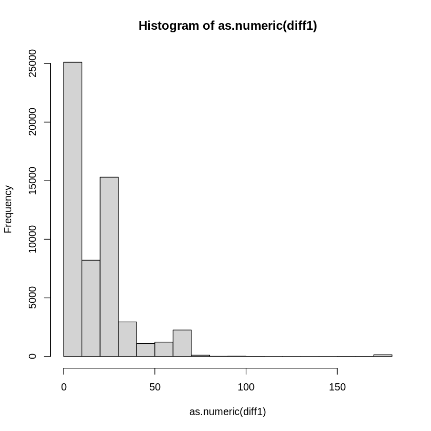
hist(as.numeric(diff1))
colnames(covidtbl)
<ol class=list-inline><li>‘id’</li><li>‘province’</li><li>‘district’</li><li>‘municipality’</li><li>‘createdOn’</li><li>‘modifiedOn’</li><li>‘label’</li><li>‘gender’</li><li>‘age’</li><li>‘occupation’</li><li>‘reportedOn’</li><li>‘recoveredOn’</li><li>‘deathOn’</li><li>‘currentState’</li><li>‘isReinfected’</li><li>‘source’</li><li>‘comment’</li><li>‘type’</li><li>‘nationality’</li><li>‘ward’</li><li>‘relatedTo’</li><li>‘point.type’</li><li>‘point.coordinates’</li></ol>
Number and percentage of the “current state” variable
current_state <- covidtbl$currentState
num_current_sate<-table(current_state)
prop.table(num_current_sate)*100
current_state
   active     death recovered
26.846319  0.639963 72.513718
Current_state variable have three type of values active, death and recovered, about 72% people are recovered. similarly, approximately 27% people have covid positive and as compared to recoved ratio only 0.63% were death. Above data signify that maximum people could recovered from covid
Number and percentage of the “isReinfected” variable, what percentage of cases were re-infected in Nepal at the given time period in the database? Was it realistic?
isreinfected <- covidtbl$isReinfected
num_isreinfected <- table(isreinfected)
prop.table(num_isreinfected)*100
isreinfected
       FALSE         TRUE
99.996144801  0.003855199
About 0.0038% people were reinfected from covid In Nepal. This ratio is too small few of the recovered people might be reinfected.
Number and percentage of “type” variable
type <- covidtbl$type
type_count <- table(type)
prop.table(type_count)*100
type
          imported local_transmission
          57.89474           42.10526
Number and percentage of “nationality” variable
nationality <- covidtbl$nationality
covidtbl_4<- covidtbl[complete.cases(covidtbl$nationality),]
currted_nationality <- covidtbl_4$nationality
nationality_count <- table(currted_nationality)
print(nationality_count)
prop.table(nationality_count)*100
currted_nationality
 2  3  4
42 14  1


currted_nationality
        2         3         4
73.684211 24.561404  1.754386
Nationality column is suffered from missing value. Due to the missing values our analysis might not be accurate.
Cross-tabulation of province (row variable) and current status (column variable) with row percentage
cross_tabul<- table(covidtbl$province, covidtbl$currentState)
cross_tabul
    active death recovered
  1    643    56      6276
  2   1825   133     13061
  3  13086   187     16462
  4   1108    28      3293
  5   2496    76      8563
  6    593     5      2950
  7   1140    13      5823
prop.table(cross_tabul)*100
          active        death    recovered
  1  0.826297596  0.071963710  8.065075755
  2  2.345245897  0.170913811 16.784250228
  3 16.816376884  0.240307388 21.154760528
  4  1.423853400  0.035981855  4.231723145
  5  3.207525348  0.097665035 11.004022257
  6  0.762044283  0.006425331  3.790945423
  7  1.464975519  0.016705861  7.482940746
Maximum corona active was in province 3, minimum corona active was in province 6, and similarly maximum people died from corona in province 3 and maximum people recovered from corona in the same province.
Cross-tabulation of sex (row variable) and current status (column variable) with row percentage
gender<- covidtbl$gender
gender <- str_to_title(gender)
cross_tabul<- table(gender, covidtbl$currentState)
cross_tabul
gender   active death recovered
  Female   6960   149     14294
  Male    13931   348     42076
prop.table(cross_tabul)*100
gender       active      death  recovered
  Female  8.9508475  0.1916202 18.3826745
  Male   17.9158415  0.4475424 54.1114741
Males were affected by corona more than females; similarly, the recovered ratio of males is greater than that of females.
Cross-tabulation of broad age groups (row variable) and current status (column variable) with row percentage
combined <- unlist(list(below_15,above_60, between_15_59))
borad_age <- as.numeric(combined)
cross_tabul<- table(borad_age, df_age$currentState)
cross_tabul
According to the data presented above, the death rate for people over the age of 60 is the highest of any age group. When compared to other age groups, the broad age group between 15 and 59 has the highest recovery rate.
Scatterplot of province (x-axis) and cleaned age (y-axis) and appropriate correlation coefficient for this bi-variate data
plot(covidtbl$province,covidtbl$age)
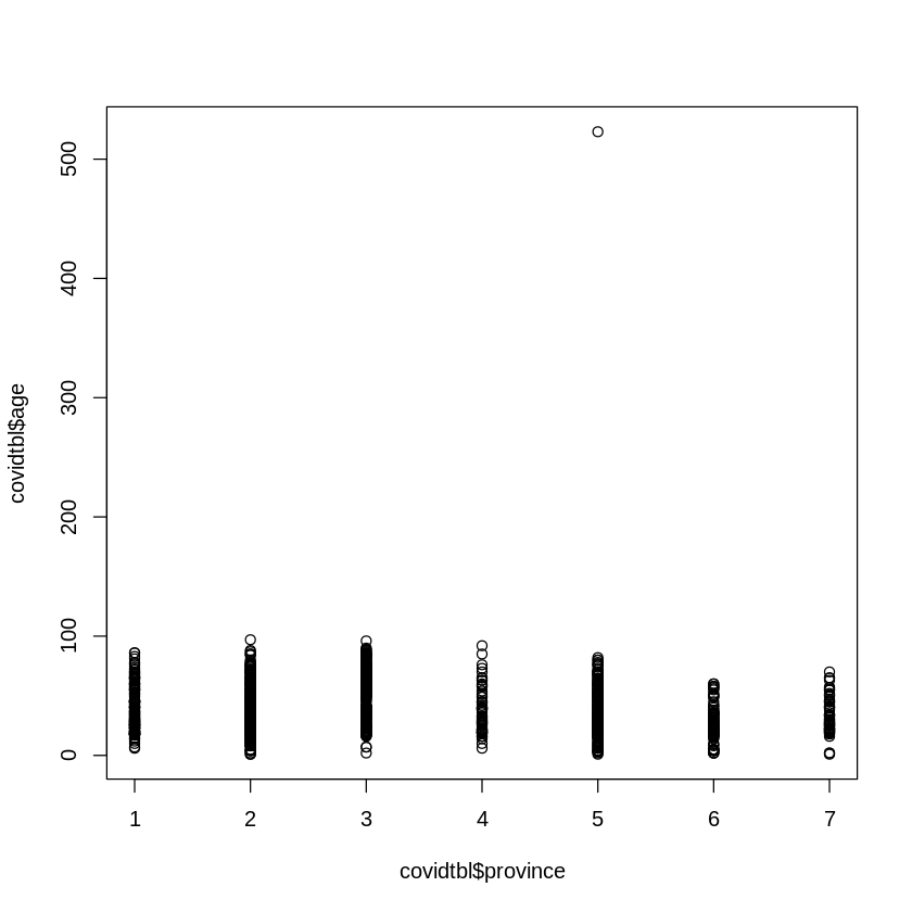
A scatter plot does not show any specific pattern; it is not linear, so in the above case, spearman rank correlation is appropriate.
cor.test(covidtbl$province,covidtbl$age, method = "spearman")
Warning message in cor.test.default(covidtbl$province, covidtbl$age, method = "spearman"):
“Cannot compute exact p-value with ties”


	Spearman's rank correlation rho

data:  covidtbl$province and covidtbl$age
S = 509628932, p-value = 1.796e-05
alternative hypothesis: true rho is not equal to 0
sample estimates:
       rho
-0.1143495
There is low degree of negative correlation
Scatterplot of age (x-axis) and diff1 (y-axis) and appropriate correlation coefficient
plot(covidtbl$age,diff1)
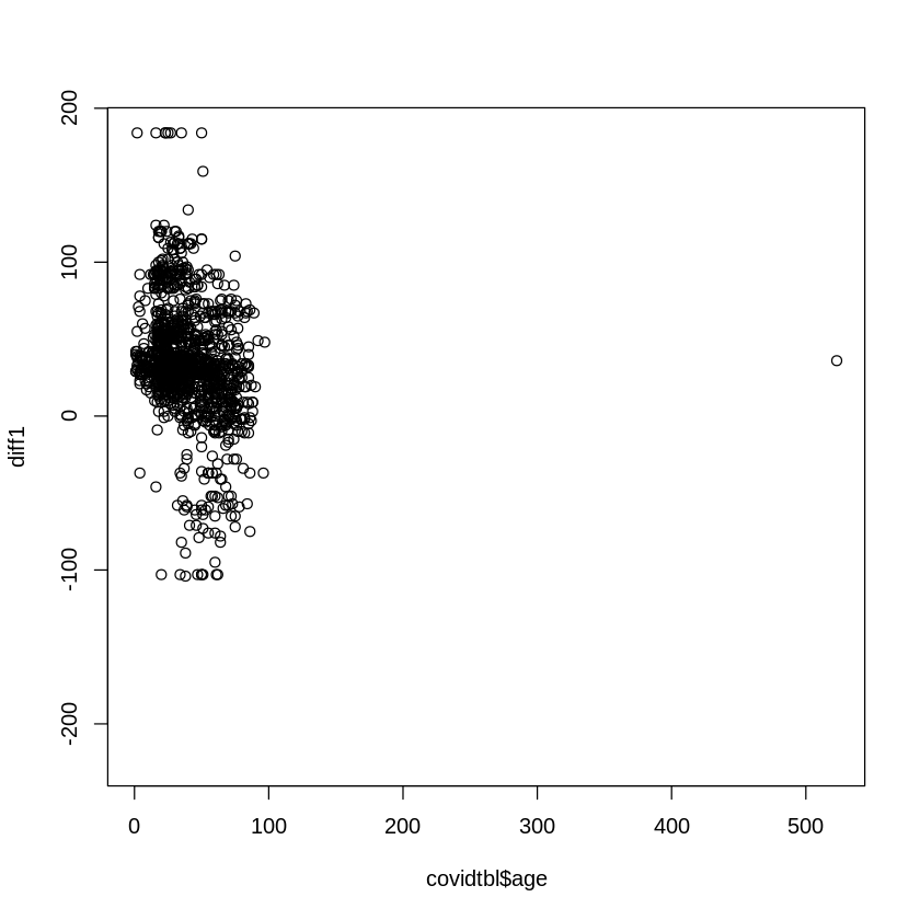
Above scatter plot do not show any specific pattern so spearman rank correlation coefficent is appropriate.
cor.test(covidtbl$age,as.numeric(diff1), method = "spearman")
Warning message in cor.test.default(covidtbl$age, as.numeric(diff1), method = "spearman"):
“Cannot compute exact p-value with ties”


	Spearman's rank correlation rho

data:  covidtbl$age and as.numeric(diff1)
S = 592527576, p-value < 2.2e-16
alternative hypothesis: true rho is not equal to 0
sample estimates:
       rho
-0.2956149
Upon scrutinizing the relationship between age and difference, a notable observation comes to light: there exists a modest degree of negative correlation between these two variables. This discovery suggests that as ages vary, the difference tends to show a mild downward tendency, albeit not overwhelmingly pronounced. The two variables share a subtle interplay that adds depth to our understanding of their connection.
Yet, this is not the end. It’s a stepping stone—a stepping stone to more questions, more revelations, and a deeper understanding. As we bid adieu to this chapter, we eagerly anticipate the next, where the spirit of curiosity will guide us to explore new dimensions and unearth more hidden gems.
Thank you for joining us on this journey. Until we meet again in the realm of data exploration, may your insights be profound and your discoveries abundant.

Comments