
Getting Started with ggplot2 in R
Grammer
A grammar provides a foundation for understanding diffrent types of graphics. A grammar may also help us on what a well-formed or correct graphic looks like, but there will still be many grammatically correct but nonsensical graphics. This is easy to see by analogy to the English language: good grammar is just the first step in creating a good sentence.
Grammar of Graphics
A grammar of graphics is a tool that enables us to clearly
describe the components of a graphics. Such a grammar allows us to move
beyond named graphics (e.g., the “scatterplot”) and gain insights into
the deep structures that underlies the statistical graphics. ggplot2
proposes an alternative parameterization of the grammar, based around
the idea of building up a graphic from multiple layers of data.
Components of ggplot2
- Data and aesthetic mappings
- Geometric objects
- Scale
- Facet Specification
- Statistical Transformation
- Coordinate Syatem
Layered grammar of graphics
Together, the data, mappings, statistical transformations and geometric objects form a layer. Plot may have different layers. Layers are responsible for creating the objects that we expect on the plots.
How to use ggplot2 in R?
For this we need to have installed ggplot2 package in our IDE. Let us
use ggplot in R builtin data diamonds.
library(ggplot2)
ggplot(diamonds, aes(carat,price)) + geom_point()

geom_point is used for scatter plot. From above figure, we can see that whenever
diamond’s carat increases, prices also increases. We can not see
how the data distibuted for this, let’s make some changes in our code.
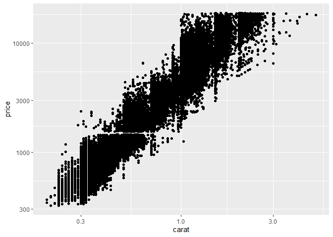
ggplot(diamonds,aes(carat,price)) + geom_point() +
  scale_x_continuous() + scale_y_continuous()

We can see better distribution of points than previous plot. We can clearly see that carat and price variable are not linearly distributed. To make it linearly distributable, lets make some changes in our code.
ggplot(diamonds, aes(carat,price)) + geom_point() +
  stat_smooth(method = lm) + scale_x_log10() + scale_y_log10()
## `geom_smooth()` using formula 'y ~ x'
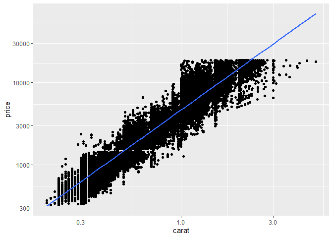
From above graph, relationship between price and carat variables is
linear. If we try the code without stat_smooth(method= lm) we can not
see linear line in graph. Where lm means linear model.
ggplot(diamonds, aes(carat,price)) + geom_point() +
  scale_x_log10() + scale_y_log10()
Lets make histogram of diamonds data
ggplot(diamonds, aes(price)) + geom_histogram()
## `stat_bin()` using `bins = 30`. Pick better value with `binwidth`.
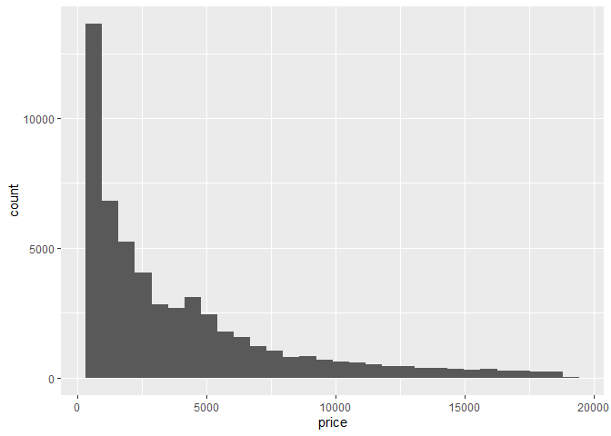
To build histogram, we use function geom_histogram(). We should note that
histogram is made on one dimensional data. If we want to add title of
the plot we can do as,
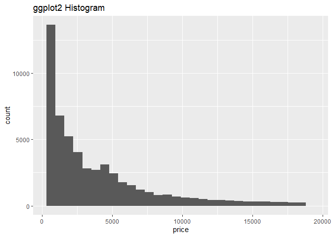
ggplot(diamonds, aes(price)) + geom_histogram() + ggtitle("ggplot2 Histogram")
## `stat_bin()` using `bins = 30`. Pick better value with `binwidth`.
Let us try some other ggplot2 features in R builtin data mtcars
ggplot(mpg, aes(x = displ, y = hwy)) +
geom_point()
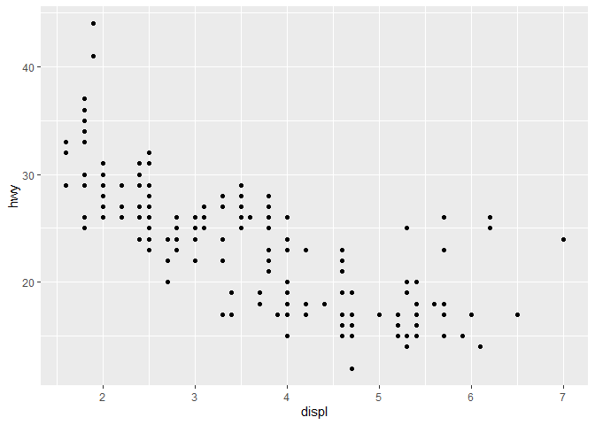
The figure above shows scatterplot betweenhwyanddisplvariables of mtcars data from figure we can see as the values ofhwyincreases, values ofdisplvariable slightly decreases.
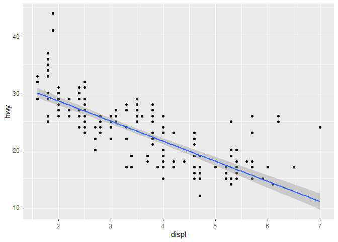
Let’s add geam_smooth(): What will happen?
ggplot(mpg, aes(displ, hwy)) + geom_point() + geom_smooth()
## `geom_smooth()` using method = 'loess' and formula 'y ~ x'
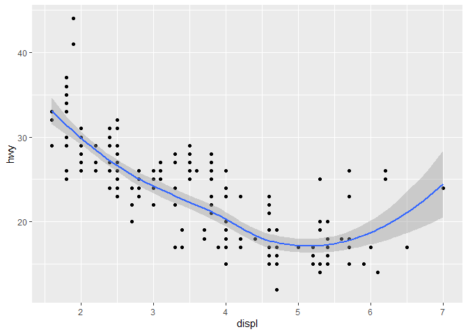
We see there is smooth line appearing on the middle of the data points.
Adding “wiggliness” in the smoothing plot
ggplot(mpg, aes(displ, hwy)) + geom_point() + geom_smooth(span = 0.2)
## `geom_smooth()` using method = 'loess' and formula 'y ~ x'
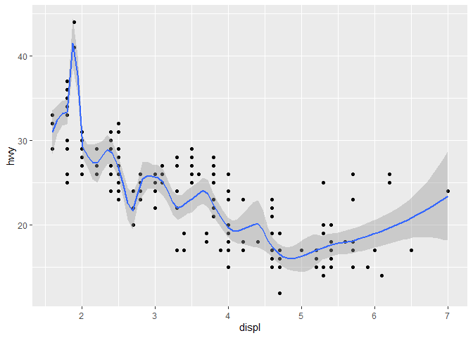
What changes can we see in above graph and previous graph. Let us again
check by keeping span = 1.
ggplot(mpg, aes(displ, hwy)) + geom_point()+ geom_smooth(span = 1)
## `geom_smooth()` using method = 'loess' and formula 'y ~ x'
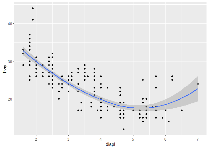
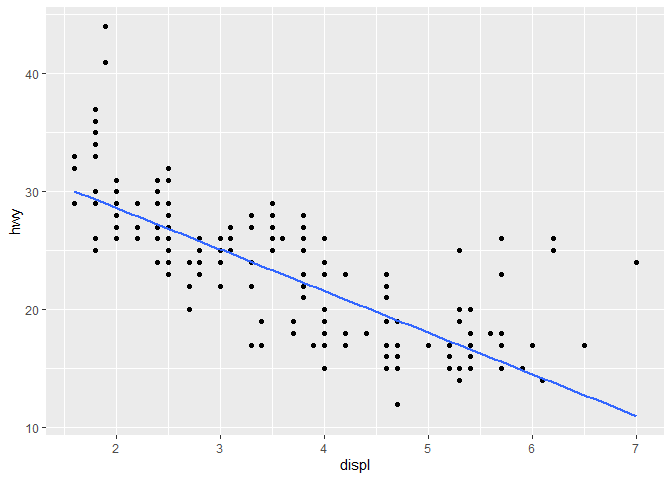
We can make sense that, by default ggplot kept value of span 1. If we set
method= lm inside geom_smooth() we can find stright smooth line. Let us
try.
ggplot(mpg, aes(displ, hwy)) + geom_point() + geom_smooth(method = lm)
## `geom_smooth()` using formula 'y ~ x'
Let Modify our code little,
ggplot(mpg, aes(displ, hwy)) + geom_point() + geom_smooth(method = lm, se= FALSE)
## `geom_smooth()` using formula 'y ~ x'
By se= FALSE we added a smooth line.
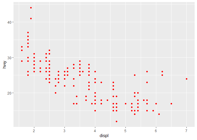
Fixed color
ggplot(mpg, aes(displ,hwy)) + geom_point(color = 'red')
Changing color by variable attributes
Lets change our color based on class.
ggplot(mpg, aes(displ, hwy, colour = class)) +
geom_point()
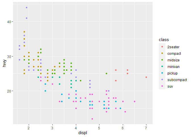
Here we gave colors according to variable’s name.
Getting multiple scatterplot of attributes
We can get multiple scatterplot by using facet_wrap() function.
ggplot(mpg, aes(displ, hwy)) + geom_point() +
facet_wrap(~class)
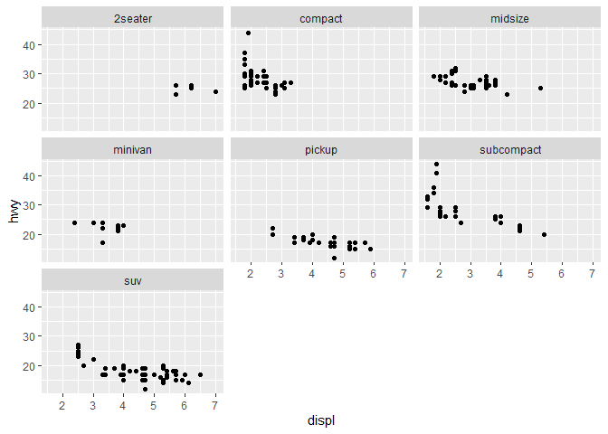
In above figure, we found distribution of various variables along with displ
and hwy variables.
Histogram
ggplot(mpg, aes(hwy)) + geom_histogram()
## `stat_bin()` using `bins = 30`. Pick better value with `binwidth`.
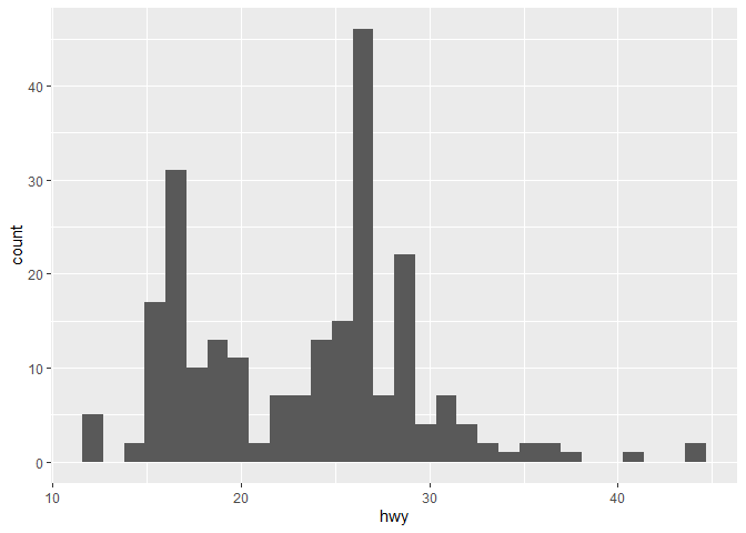
hwy variable bins automatically.
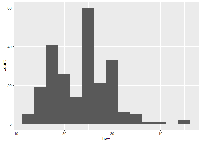
Changing bin size of the histogram
ggplot(mpg, aes(hwy)) + geom_histogram(binwidth = 2.5)
Frequency polygon
A frequency polygon is a line graph of class frequency plotted against class midpoint. It can be obtained by joining the midpoints of the top of the rectangles in the histogram.
ggplot(mpg, aes(hwy)) + geom_freqpoly()
## `stat_bin()` using `bins = 30`. Pick better value with `binwidth`.
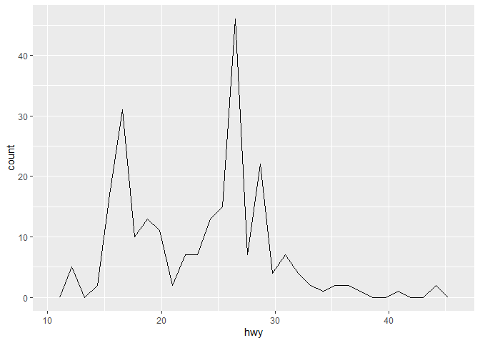
Change Bin size of frequency Polygon
ggplot(mpg, aes(hwy)) + geom_freqpoly(binwidth= 1)
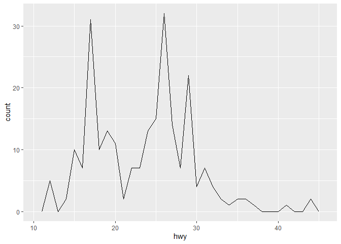
We can see the effect of binwidth from figure by comparing above figure with previous one.
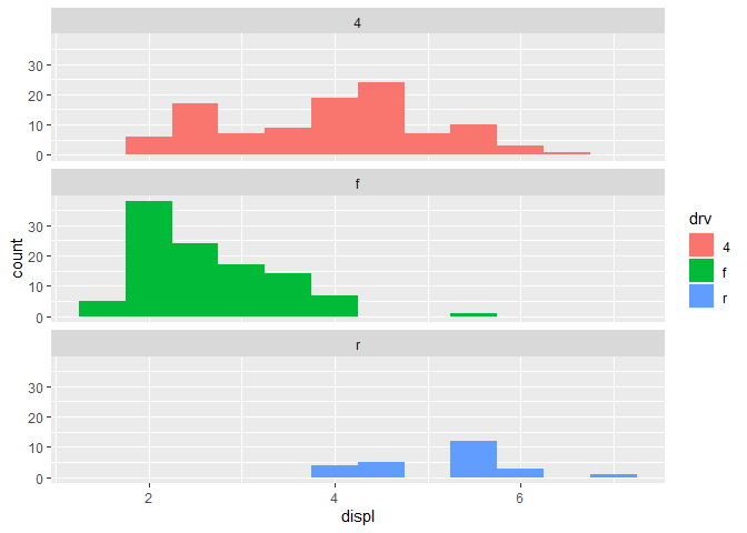
Histogram with faceting:
We have already discussed about what a facet does in scatter plot. Similarly, in histogram it gives multiple subplots.
ggplot(mpg, aes(displ, fill = drv)) + geom_histogram(binwidth = 0.5) +
facet_wrap(~drv, ncol = 1)
Bar plot
ggplot(mpg, aes(manufacturer)) + geom_bar()
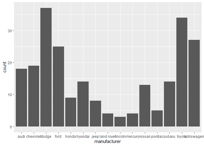
We can draw bar plot in geom_bar() function. From bar plot we can see
dodge and toyotao has maximum frequency.
Let’s Use alpha inside geom_point()
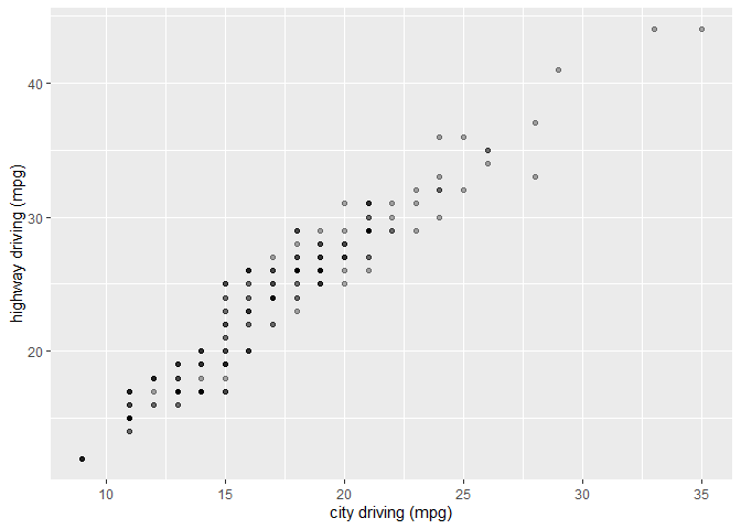
ggplot(mpg, aes(cty, hwy)) + geom_point(alpha = 1 / 3)
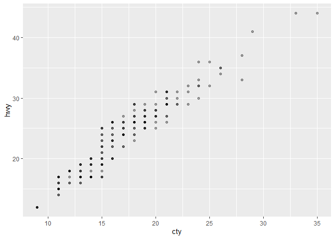
Alpha refers to the opacity of a geom. Values of alpha range from 0 to 1, with lower values corresponding to more transparent colors.
Modifying the axes
ggplot(mpg, aes(cty, hwy)) +geom_point(alpha = 1 / 3) + xlab("city driving (mpg)") +
ylab("highway driving (mpg)")
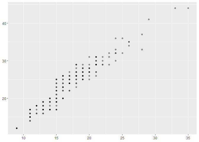
ggplot(mpg, aes(cty, hwy)) + geom_point(alpha = 1 / 3) + xlab(NULL) +
 ylab(NULL)
Thats all for this part, thank you so much for reading.

Comments